2023 - 2025
Tooth Angel: Planet-Friendly, Luxury, Oral Hygiene Care.

Branding Website Packaging Products
A visual identity, website and packaging design for sustainable, luxurious, oral hygiene brand, Tooth Angel.
Tooth Angel is redefining oral care with a luxurious, sustainable, and dentist-approved range of products. Partnering closely with founder, I crafted a high-end brand identity, bespoke packaging, and an elegant e-commerce website.
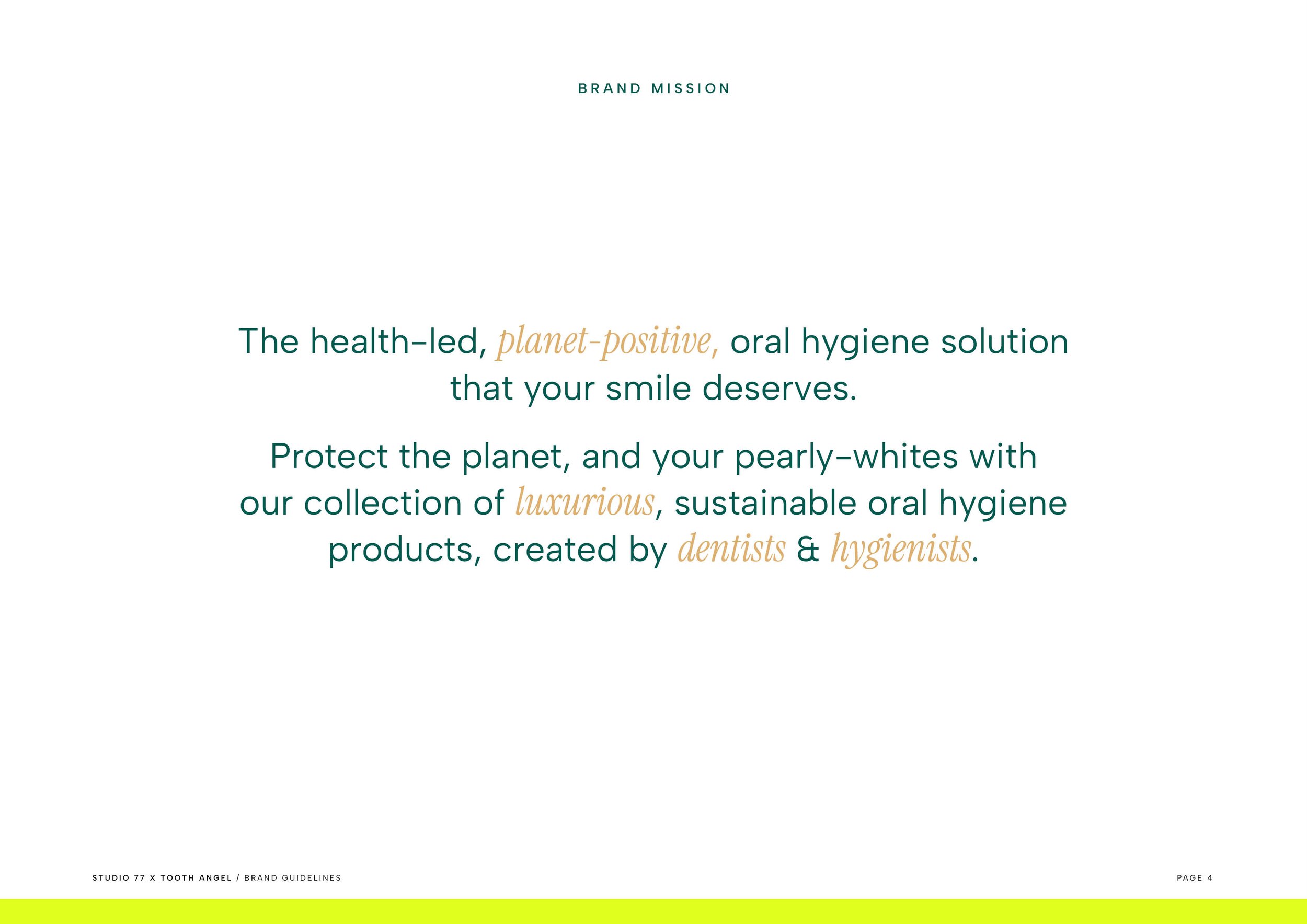
The goal was to create a brand that blends clinical expertise with consumer appeal, positioning Tooth Angel as a leader in premium oral care.


Flossing, but make it…luxury!
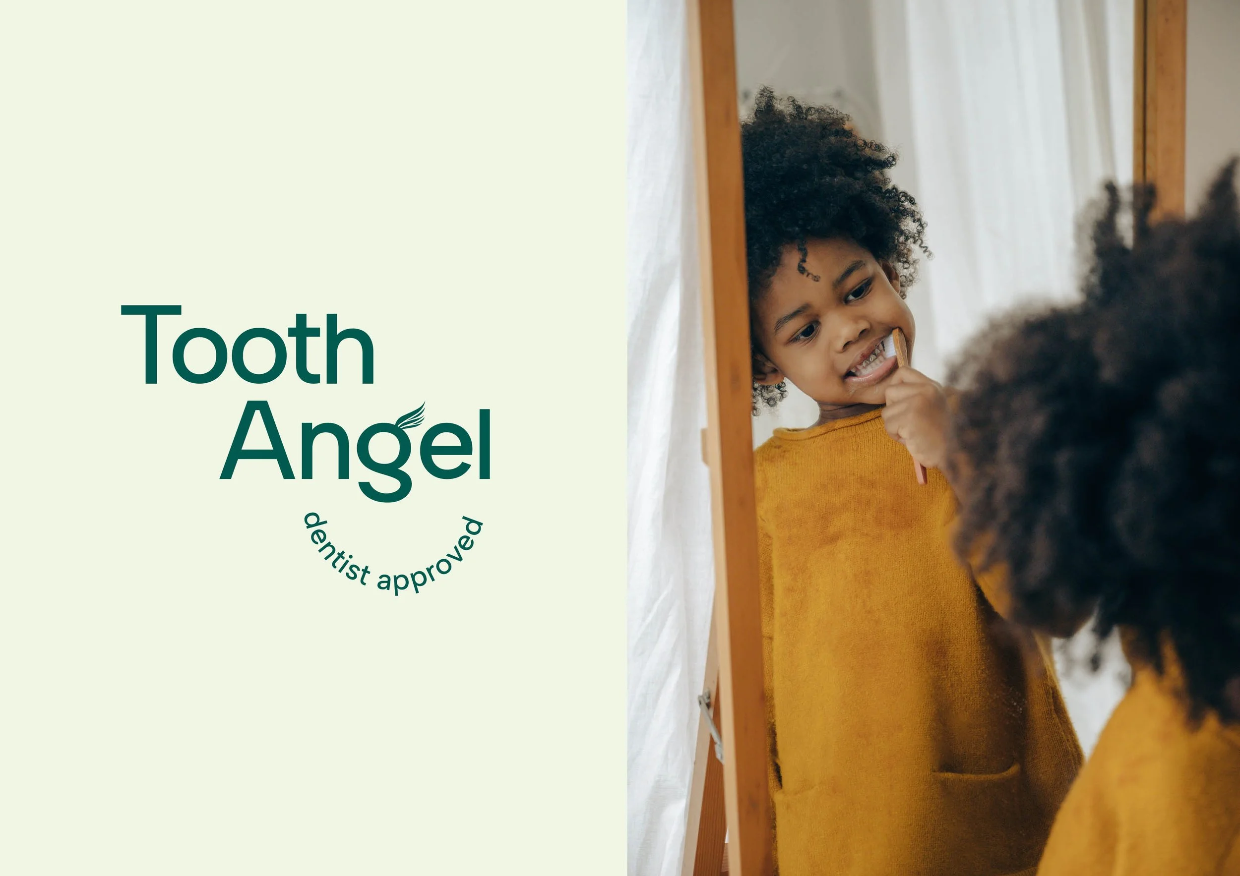
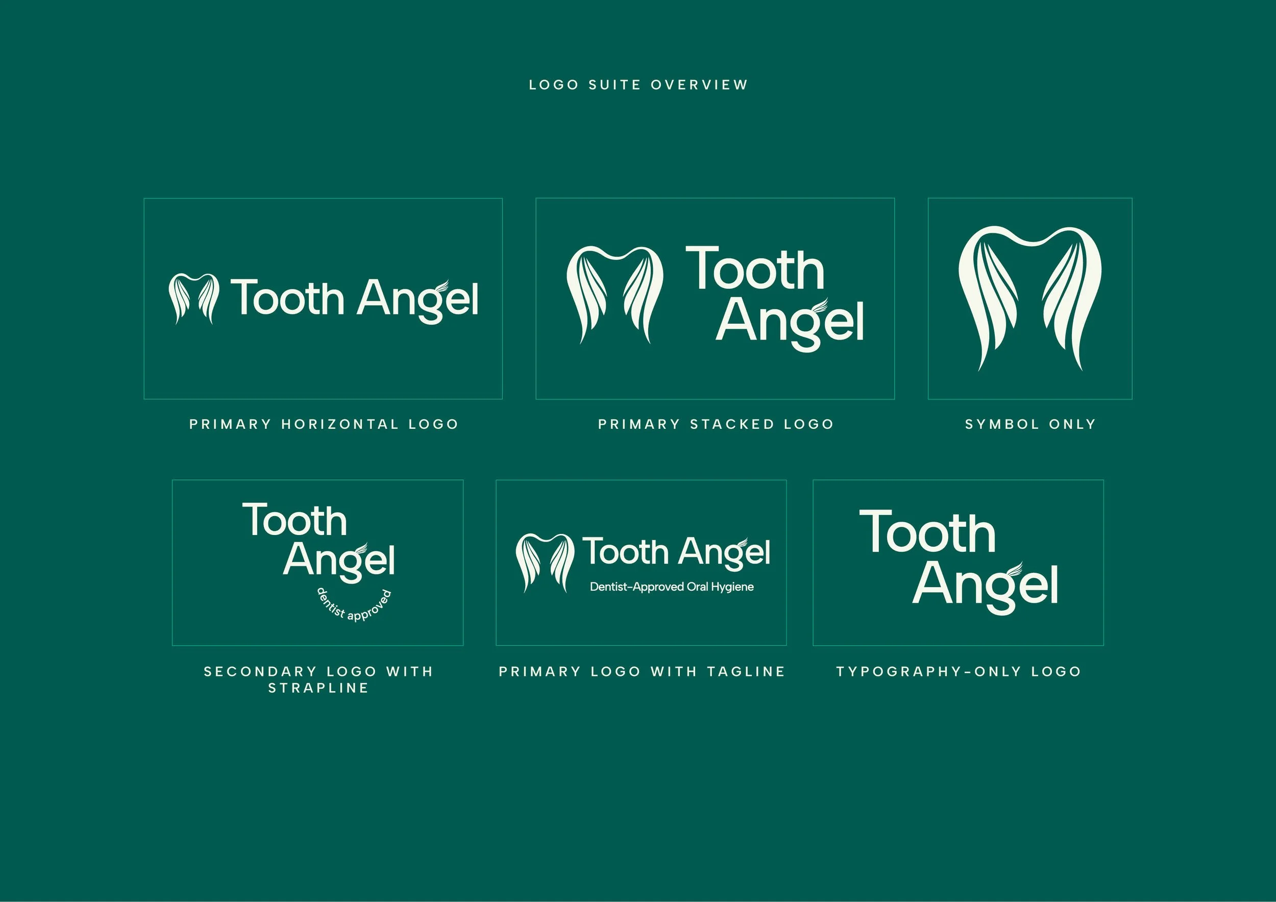
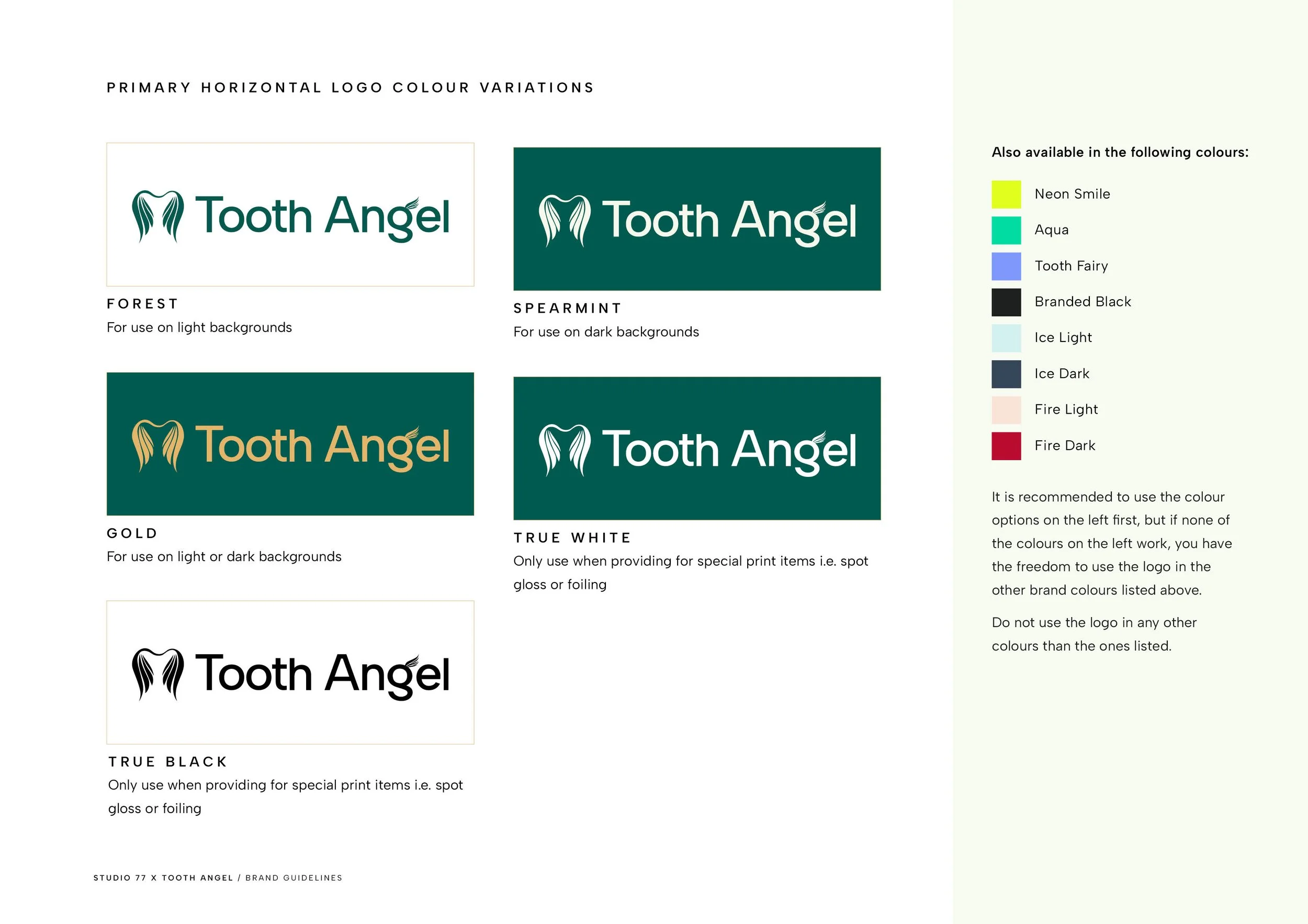
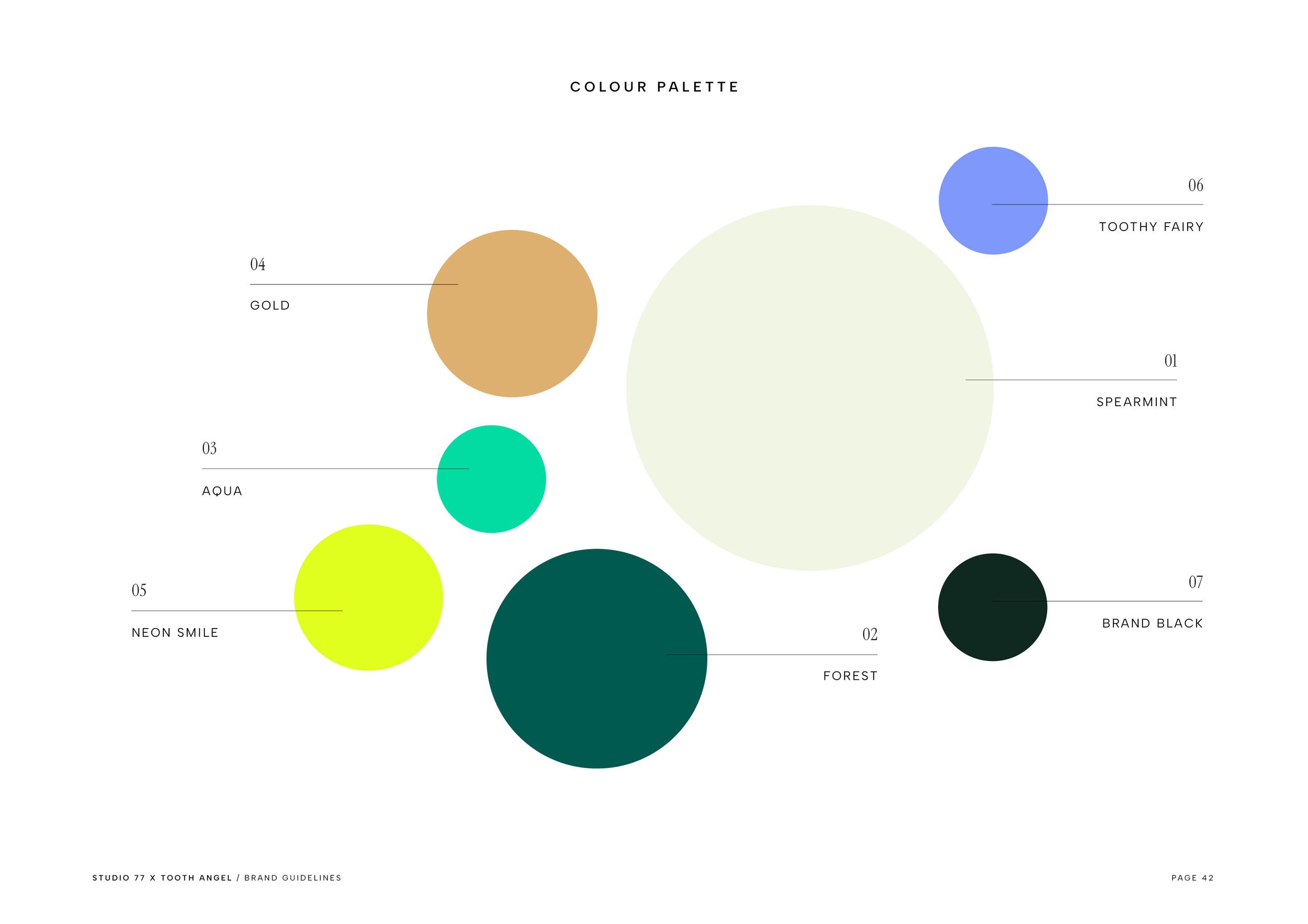
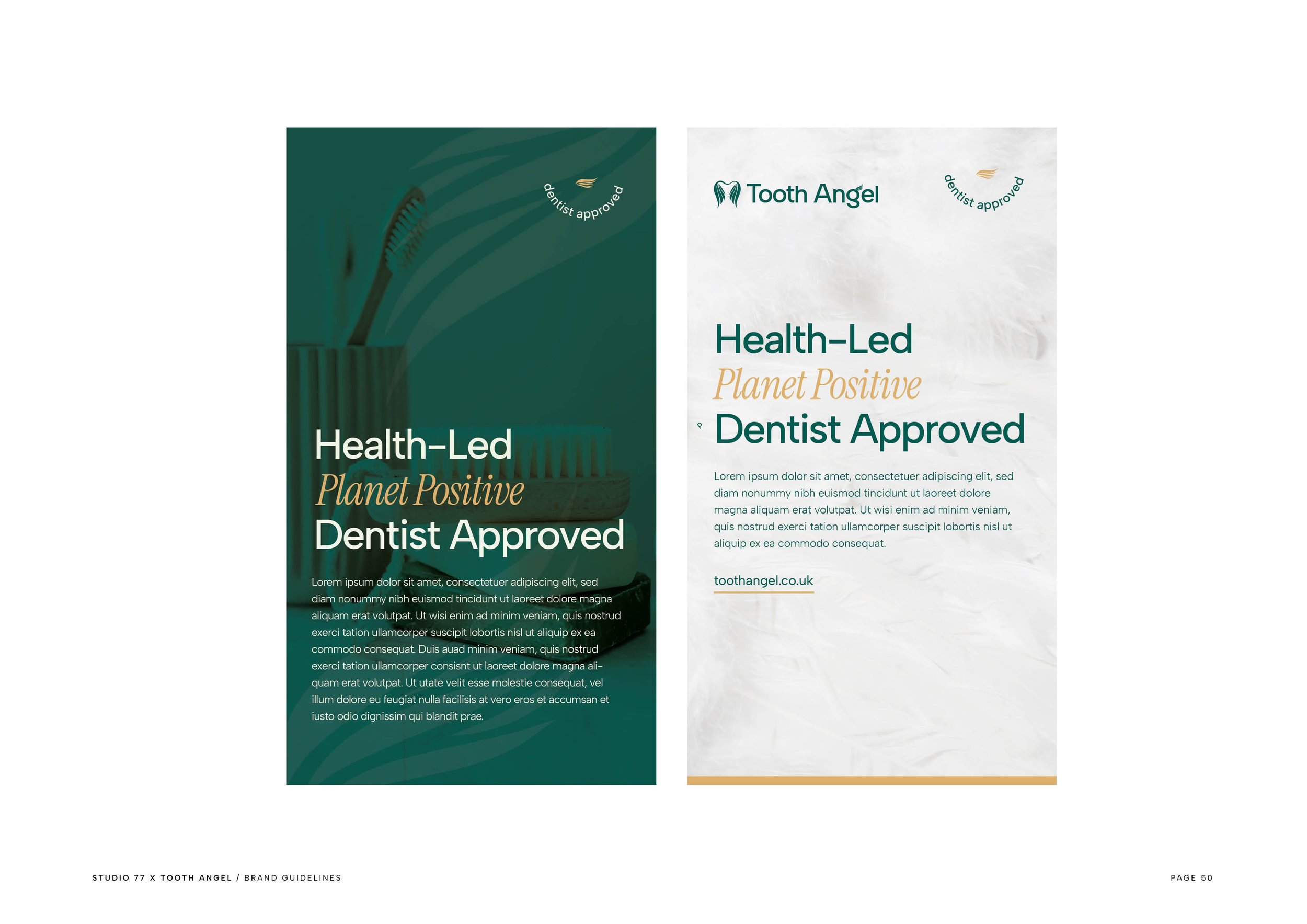
The brand was brought to life through a forest green and gold palette that conveys luxury and sustainability, paired with clean white for balance. The logo features a carefully crafted angel wing integrated into the serif of the ‘g,’ adding a sophisticated yet approachable touch.
The packaging design reflects the brand’s ethos of transparency and indulgence, while the website delivers a seamless, premium shopping experience that aligns perfectly with Tooth Angel’s mission.

Project Deliverables
-
Tooth Angel’s brand design was created to feel distinctive and purposeful. The logo incorporates a subtle angel wing within the ‘g,’ adding a meaningful visual cue without overstatement.
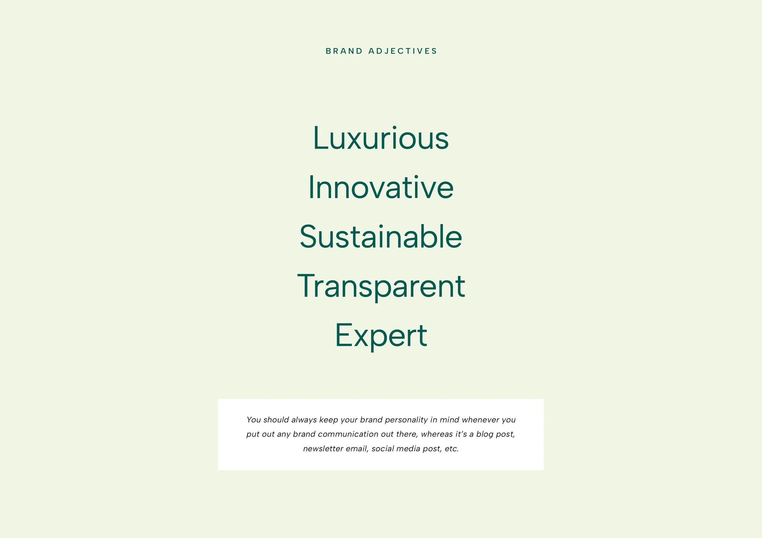
The colour palette draws from deep green tones paired with warm gold highlights to convey trust and expertise, while clean white elements ensure a polished, professional look. The typography balances a classic serif foundation with modern details, appealing to both clinical and consumer audiences.
-
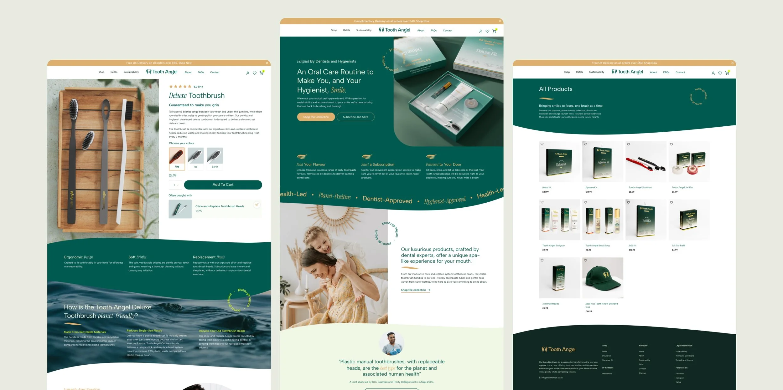
The Tooth Angel website was crafted to reflect its premium positioning while delivering a seamless user experience. The design features clean, minimalist layouts that highlight the brand’s sustainable ethos and luxury products.
In-depth product pages showcase details like refill options, emphasising convenience and eco-friendliness. Soft hover effects and intuitive navigation ensure the shopping journey feels smooth and engaging, while strategic use of the brand’s colour palette reinforces consistency across the digital experience.
-
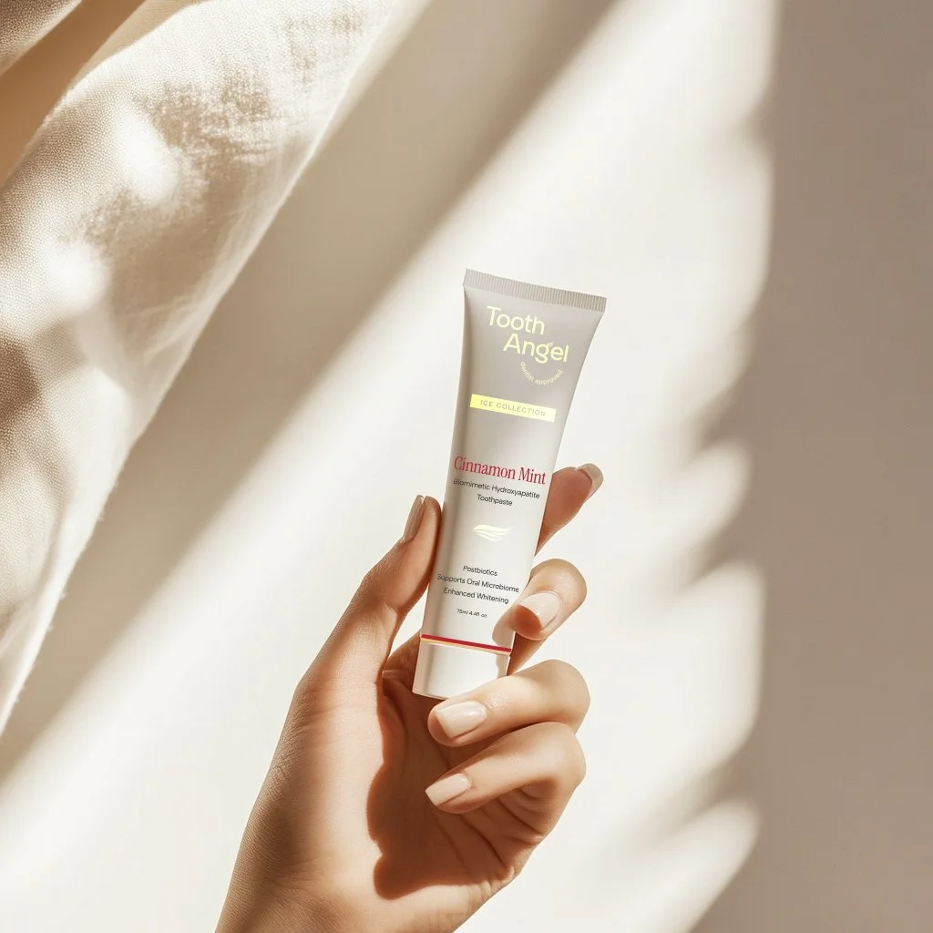
For Tooth Angel’s packaging, simplicity and practicality were key. Each product, from toothpaste and floss to refill kits, was designed with clear, easy-to-read labels and a streamlined aesthetic. Refill kits incorporate efficient use of materials to reduce waste while maintaining a visually cohesive look. The design prioritises usability while incorporating understated elements, ensuring products feel functional yet aligned with the brand’s overall vision.
-
I designed investor pitch decks and presentations that were pivotal in helping Tooth Angel secure funding.
These decks combined sleek layouts with concise, impactful visuals to communicate the brand’s mission, market potential, and product innovation. The designs emphasised clarity and professionalism while maintaining alignment with the brand’s luxurious and sustainable identity, ensuring every slide left a lasting impression.
Inside the Brand Guidelines


“When you have a vision of your brand and website and it is brought to life even better than you imagined, you get blown away. This is what Ruby and the Studio 77 team have done for Tooth Angel.”
Shameek Popat, Tooth Angel